-
Buy props used in MaryJane’s books and magazine!
5% of profits will benefit www.firstbook.org, a non-profit that provides new books to children from low-income families throughout the U.S. and Canada.

Here’s how:
MaryJane will post a photo and a description of a prop and its cost along with a few details as to its condition here: https://shop.maryjanesfarm.org/MaryJanesCurations. It’s a playful way to be the new owner of a little bit of farm herstory.


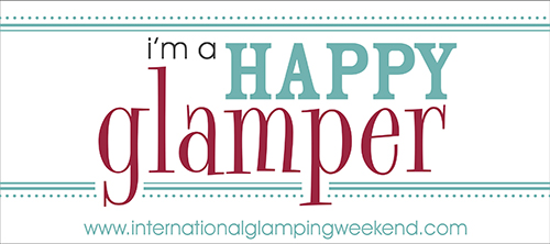




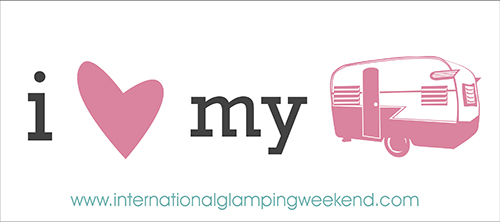
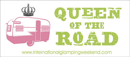









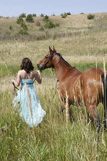 “Saddle your dreams before you ride them.” -Mary Webb



No. 2 is my favorite also – just edging out the one with the peace sign which speaks to the old hippie in me : )
One or six.
They’re all good! I really like #9 (could it have a dark background color like dark turquoise or red so that the lettering stood a little more?). Also, I think #2 is SUPER clever!
Hmmmm, good ideas! 1 is easiest to read and I like the color combo… 2 is very creative, just hard to read, esp. if you aren’t a glamper! 9 is great with the reverse and font twists…I agree with Shery on the darker background, would “pop” it out more. I think that is why 3/4 caught my eye first… Can’t wait to see the final!
I personally like #2. It states what I want todo!
LOVE #1 and #2. Also HUGE FAN of #7, #8 and #9. Do you have to have just one??? If you do them, I would LOVE to have a #1 bumper sticker!!
I like #1 =)
My favorite is #7.
My votes go to #2 and #5. Love ’em all Molly girl!!!! ace
7 or 8, the font from 8 and the design of 7, with a tipped crown. perfect!
#1!
I like #5 best!
My favorites are 6 and 7!
1, 4 or 9. 9 with a turquoise background. And 1 becoz its simple
I like #1 and #5…well, I like all of them, but hard to choose just one. Soooo, why not give the gals what they want? Several to choose from! :>)
#9 ABSOLUTEY!!! then #4 & 3. Or just all of them & there will be something different all over the world:)
1 & 9
I like #5.
#2, too.
My fav is # 1.
I like #8. Easy on the eyes when you see it while driving.
I like 1 & 9 the best but would like to see them with the retro trailer in it!
Number 1 and Number 9. Number 2 is really interesting, but I find it hard to read. (For next time, how about some campers other than Shasta? 🙂 ) I really, really like what we have now…..if I had my druthers, I wouldn’t be changing it at all!
You’re admission did not influence me. As soon as I saw #2, I loved it! It just stands out among the rest. #7 is a very close second.
I’m partial to 1!
Hello ladies, I’m kind of new to this board & completely inexperienced in the Glamping community but depending on what your goal is for the sign(?) I would prefer to read: #1; #5; #7 or #9. Love puzzles & pictures but I’m a bit of a Nervous~Nelley when driving so if it is not clear & succinct then I would probably not try to read it while driving. To me, the ones I noted above tell the story & also direct more viewers to your website & the Glamping community. However all of your designs are creative but the bumper sticker sloagans may reach more Glampers on a different type of billboard?
#9 without a doubt is my favorite.
#2 is my favorite .. but being a tenter at heart I love #4 also… tenting is glamporous too you know!!!