


Old maps have a certain charm, don’t they?
Sea serpents, buried treasures, lands yet to be explored …
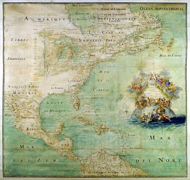
Map of the northern part and parts of the southern parts of the Americas by Abbot Claude Bernou, circa 1681, courtesy of Wikimedia Commons
They stir a whisper of wanderlust, even in the heart of this happy homebody.
Similarly struck by historical maps, a statistician named Nathan Yau has made it his mission to recreate maps of my favorite country in the world (this one, of course!). Yau’s maps are updated versions of maps he unearthed in the original Statistical Atlas of the United States, which was based on the 1870 census.
While these maps aren’t the sort that feature X’s marking moth-eaten mysteries, they do contain an abundance of fascinating facts rarely recorded until the late 1800s.
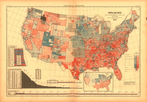
Statistical Atlas of the United States, 1880, Popular Vote, Census.gov
“Up to that point, cartographers mostly made maps that captured physical features of the landscape: a river here, a city there, and so on. But the Statistical Atlas did something very different: It also mapped things you can’t see directly, things like crop yields, the prevalence of disease, the provenance of people,” explains Greg Miller of Wired. “It freed data that had been locked up in lists and tables and made it spatial.”
When he learned that recent U.S. Census Bureau budget cuts thwarted a plan to publish a new atlas from 2010 data (the last one was made in 2000), Nathan Yau was inspired to start scouring government websites for data so that he could update the atlas on his own.
“Ever since I found out about the Statistical Atlas of the United States, historically produced by the Census Bureau, it annoyed me that there wasn’t one in the works for the 2010 Census due to cuts in funding,” says Yau. “I got to thinking, hey, I could do that. And if I did, I wouldn’t have to be annoyed anymore. So I recreated the original Statistical Atlas of the United States with current data. I used similar styling, and had one main rule for myself: All the data had to be publicly available and come from government sites.”
He combed the 1870 atlas and made 59 comparable maps and charts (rather lovely to look at) that covered the same features, from annual rainfall to ancestry. The maps are available for your trivia treasure hunting at FlowingData.com.


Now this was a true labor of love on Yau’s part. I bet the maps are not only beautiful but fascinating as well. It sounds like it could qualify as a national treasure.
His maps are frame-worthy, and I loved his running commentary, too!
Can’t wait to look at his maps for myself. Winnie you are so right on when you say they are a labor of love!. One person can “do it” and make such a difference.